Bubble Charts in Python (Matplotlib, Seaborn, Plotly)
Implementation of Bubble Charts in Python

We use bubble charts to examine more than one variable together (multivariate). As in the scatter plot, the x-y Cartesian coordinate system is used. As x and y are numeric values, one more numeric variable is involved. This additional variable is expressed by the area given to the points in the coordinate system where each point with area represents a categorical data. A higher level distinction can be made by separating the groups in the categorical data into colors. In other words, thanks to the bubble charts, comparisons of categorical data can be made using 3 numerical variables.
I will use “gapminder” dataset to demonstrate bubble chart.
import plotly.express as px
df = px.data.gapminder().query("year==2002")
df.head()
Matplotlib
import matplotlib.pyplot as pltfig = plt.figure(figsize = (14, 8))
plt.scatter(df["gdpPercap"], df["lifeExp"],
            s=df["pop"]*0.00001, alpha=0.5)plt.show()
x: gdpPercap, y: lifeExp and z (area of each point): pop * 0.0001.

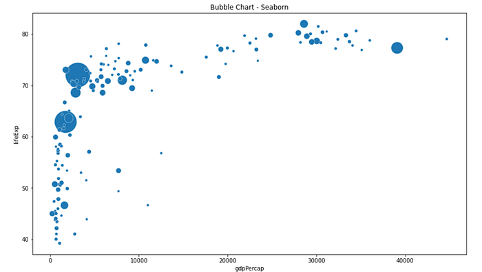
Seaborn
import seaborn as snsfig = plt.figure(figsize = (14, 8))
ax = sns.scatterplot(data=df, x="gdpPercap", y="lifeExp", size="pop", legend=False, sizes=(20, 2000))
ax.set(title='Bubble Chart - Seaborn')
plt.show()

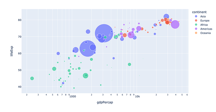
Plotly
Let’s color each continent to make it distinguishable, and, use logarithmic scale in the x-axis.
import plotly.express as pxfig = px.scatter(df, x="gdpPercap", y="lifeExp",
          size="pop", color="continent",
                 hover_name="country", log_x=True, size_max=60)
fig.show()

Thanks for reading. If you have any questions or comments, please feel free to write me!
Read More…
References
https://www.python-graph-gallery.com/270-basic-bubble-plot

